Crafting a resume that stands out starts with clear, professional presentation — and your font choice plays a crucial role. In 2026, the best font for your resume balances readability, professionalism, and compatibility with applicant tracking systems (ATS). This guide covers practical recommendations, examples, formatting tips, and how to get discovered by hiring agents on Parlel.
TL;DR
- Choose simple, professional fonts like Arial, Calibri, or Garamond for readability and ATS compatibility.
- Use font sizes between 10 and 12 points for body text; headings can be slightly larger (up to 14 pt).
- Sans serif fonts generally improve on-screen readability, especially for online applications.
- Maintain consistent font usage and limit your resume to two or three font sizes for a clean hierarchy.
- Avoid decorative or script fonts that reduce clarity and may confuse ATS software.
What Is the Best Font for a Resume?
Selecting the best font for your resume means prioritizing clarity, professionalism, and ease of reading both on screen and in print. According to Indeed, fonts like Arial and Times New Roman remain classic choices because they are widely available and familiar to recruiters and ATS systems alike. LinkedIn also recommends simple sans serif fonts such as Calibri, Lato, and Verdana for their clean appearance and excellent on-screen legibility.
The "best" font is not universally fixed but depends on your industry, the medium (digital or print), and how your resume will be processed. However, sticking to standard, professional fonts ensures your resume looks polished and passes through ATS filters without issues.
Best Resume Fonts: Readable Options for Different Styles
Here are some top fonts that work well on resumes, categorized by style:
Sans Serif Fonts (Modern, Clean, On-Screen Friendly)
- Arial: A classic, neutral font recommended by Indeed for its wide availability and readability.
- Calibri: The default Microsoft Office font, clean and modern, favored for digital resumes.
- Verdana: Slightly wider spacing, great for readability on screens.
- Lato: A contemporary sans serif with a friendly yet professional look.
Serif Fonts (Traditional, Formal, Print-Friendly)
- Times New Roman: The traditional resume font, formal and easy to read in print.
- Garamond: Elegant and less dense than Times New Roman, good for creative or academic roles.
- Georgia: Designed for clarity on screens, a serif alternative that balances tradition with readability.
Fonts to Avoid
- Script or cursive fonts (e.g., Brush Script)
- Decorative or novelty fonts (e.g., Comic Sans, Papyrus)
- Overly condensed or stylized fonts that reduce legibility
Maintaining professionalism and clarity is key; avoid fonts that distract or confuse the reader.
What Font Size Should You Use on a Resume?
Font size affects readability and how much content fits on a page. Indeed recommends:
- Body text: 10 to 12 points — this range balances readability and space.
- Headings: 12 to 14 points — slightly larger to create clear section hierarchy.
- Avoid: Smaller than 10 points (too hard to read) or larger than 14 points (wastes space and looks unprofessional).
Use no more than two or three font sizes throughout your resume to keep the layout consistent and easy to scan.
Serif vs. Sans Serif: Which Works Better?
The choice between serif and sans serif fonts depends on your resume’s format and the industry:
- Sans Serif: Better for digital resumes viewed on screens. Their clean lines and open shapes improve readability in online applications and ATS parsing. LinkedIn emphasizes sans serif fonts for their online clarity.
- Serif: Often preferred for printed resumes or industries valuing tradition (law, academia). Serifs can guide the eye along lines of text, improving print readability.
Neither is universally better; choose based on your target employer and how you will submit your resume. Consistency is more important than font family switching.
How to Choose a Resume Font for Your Industry
Different industries have varying expectations for resume presentation:
- Corporate/Finance/Legal: Stick to classic fonts like Times New Roman, Arial, or Calibri. Formal and conservative.
- Creative Fields (Design, Marketing): You can use fonts like Garamond or Lato to add subtle personality, but avoid anything too flashy.
- Tech/Startups: Modern sans serif fonts such as Calibri or Verdana work well for a clean, contemporary look.
- Education/Academia: Serif fonts like Garamond or Georgia convey professionalism and tradition.
Research your industry’s norms and match your font choice accordingly. When in doubt, prioritize readability and ATS compatibility.
Resume Font Formatting: Headings, Spacing, and Consistency
Good typography is more than font choice — formatting matters:
- Headings: Use bold and slightly larger font sizes (12-14 pt) to separate sections clearly.
- Line spacing: 1.0 to 1.15 spacing keeps text compact but readable. Avoid single-spacing that crowds text.
- Margins: Standard 1-inch margins ensure your resume doesn’t look cramped.
- Consistency: Use the same font family throughout; do not mix multiple fonts.
- Limit font sizes: Stick to two or three sizes maximum — for example, 11 pt body, 13 pt headings, and 10 pt for contact info or footnotes.
These practices create a clean hierarchy and improve the resume’s scan-ability by recruiters and ATS.
Fonts and Formatting Mistakes That Hurt Readability
Common pitfalls to avoid:
- Using too many font types or sizes, which creates visual clutter.
- Choosing fonts that are too small or too large.
- Overusing italics or underlining, which can be hard to read on screen.
- Using colors that reduce contrast (e.g., light gray on white).
- Ignoring how the resume appears on different devices or ATS systems.
Always preview your resume on multiple devices and run it through ATS simulators if possible to catch issues before applying.
How to Check Your Resume Font Before Sending It
Before submitting your resume:
- Print a copy: Check readability on paper, especially if the employer requests printed resumes.
- View on multiple devices: Open your resume on desktop, tablet, and phone to ensure consistent appearance.
- Test ATS compatibility: Use free ATS resume scanners online to verify your font and formatting parse correctly.
- Get feedback: Ask a friend or mentor to review your resume’s readability and professionalism.
- Check file format: Save as PDF to preserve fonts and formatting across systems.
Taking these steps helps ensure your resume looks polished and professional to both humans and machines.
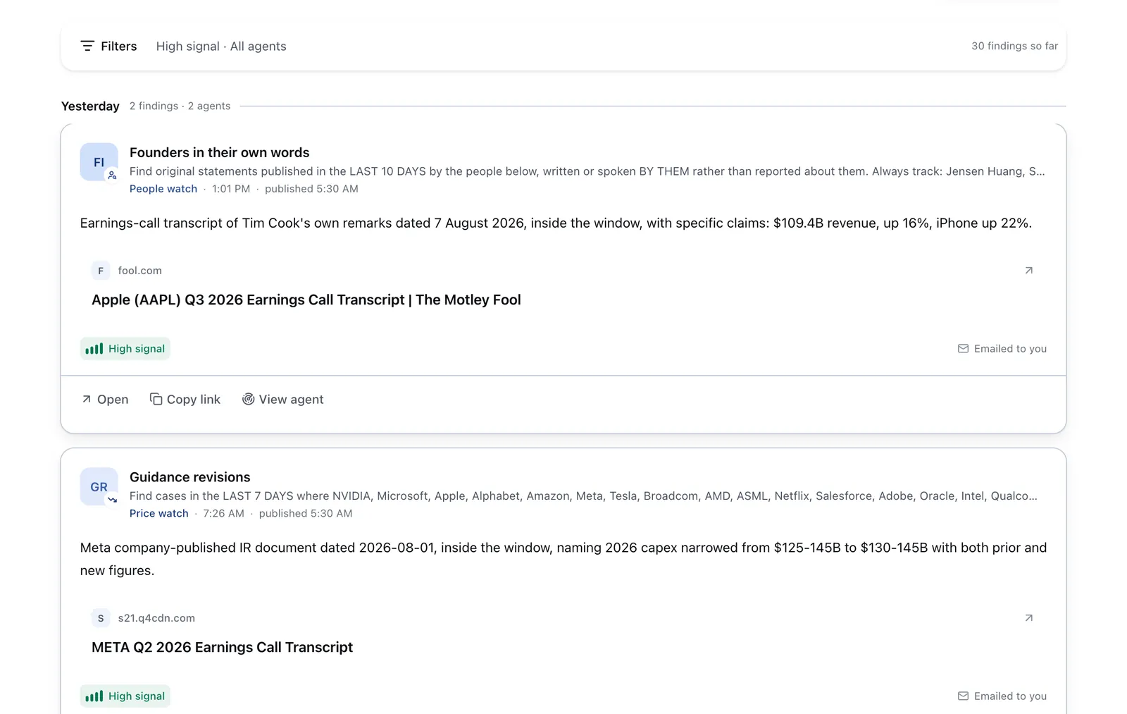
Run it on Parlel
Publish your skills on your Parlel profile and set your status to open-to-work to increase your visibility. You can also run or follow agents that watch for jobs matching your skills and resume style preferences like font and formatting. This proactive approach helps you get matched with relevant roles without constant searching.
Explore opportunities and agents at /explore and see matching jobs at /jobs.
Keep reading
FAQ
What is the best font to use on a resume?
Simple, professional fonts like Arial, Calibri, and Times New Roman are best. They offer readability, ATS compatibility, and a clean look.
What font size should a resume be?
Body text should be between 10 and 12 points, with headings slightly larger (12–14 points) for hierarchy.
Is Arial or Times New Roman better for a resume?
Both are good choices. Arial is a sans serif font better for on-screen reading, while Times New Roman is a serif font preferred in traditional industries or print resumes.
Are sans serif fonts better for resumes?
Sans serif fonts generally improve readability on screens and are favored for digital resumes, but serif fonts are still suitable for print or formal sectors.
What fonts should you avoid on a resume?
Avoid decorative, script, or novelty fonts like Comic Sans, Papyrus, or Brush Script, as they reduce professionalism and can confuse ATS software.
Sources and further reading
- Best Font for a Resume: How To Choose Type and Size (Indeed)
- Best Font for Resume: How To Choose Type and Size (Indeed India)
- The best resume fonts (LinkedIn)
- Guide to using the right fonts (LinkedIn)
- Best Resume Templates and Types (Indeed)